

In this short tutorial I will show you how you can create a dashboard in Powerpoint using our tool Office Analytics and your own data. You can start your free 30-day trial here www.office-bi.com and contact me for a free personal online demo
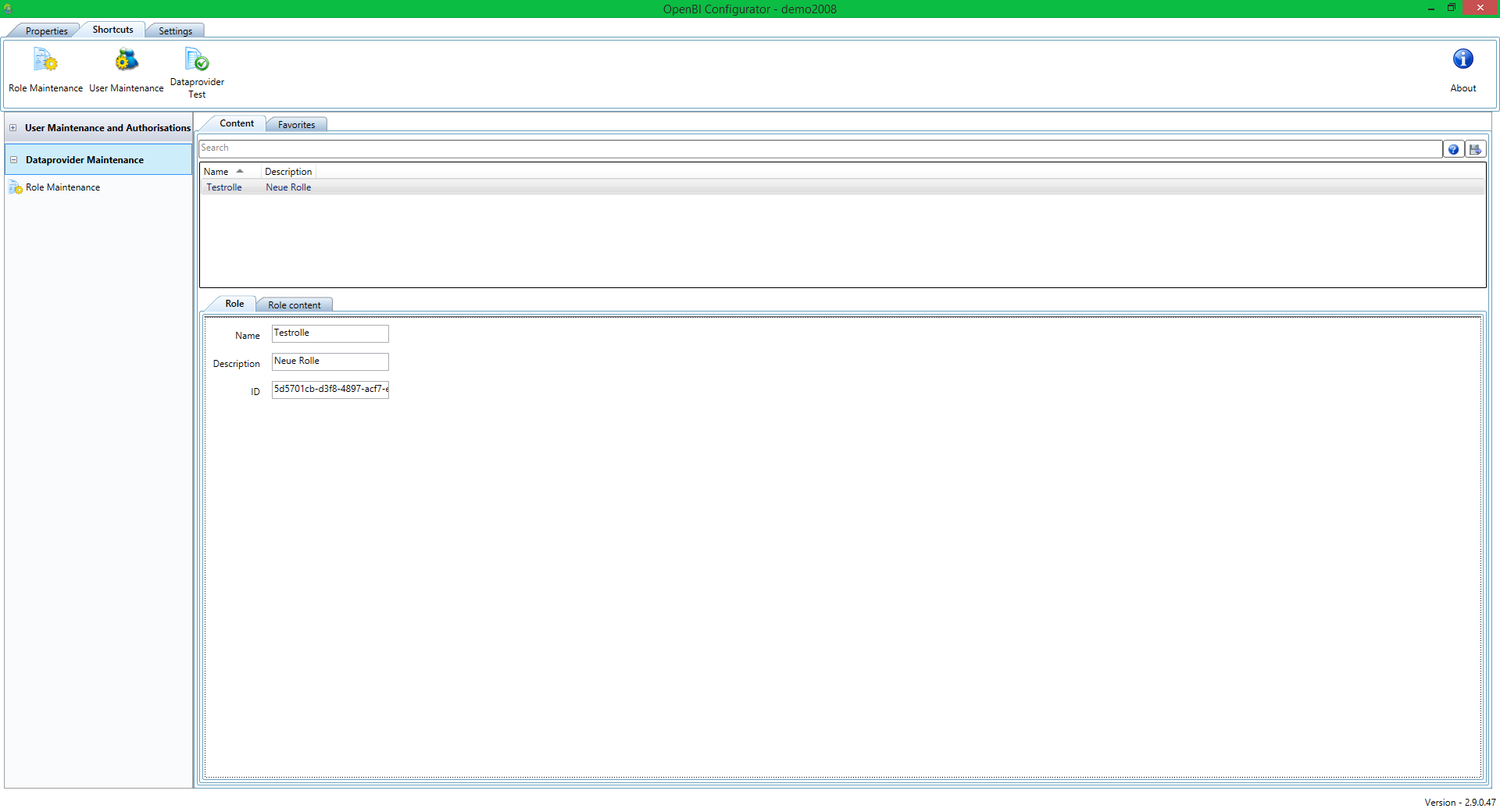
Office Analytics comes with a set of demo data. In this demo role (‘Testrolle’) you will find a few data provider.
First let’s add a new data provider. We are going to use an Excel sheet we created earlier.
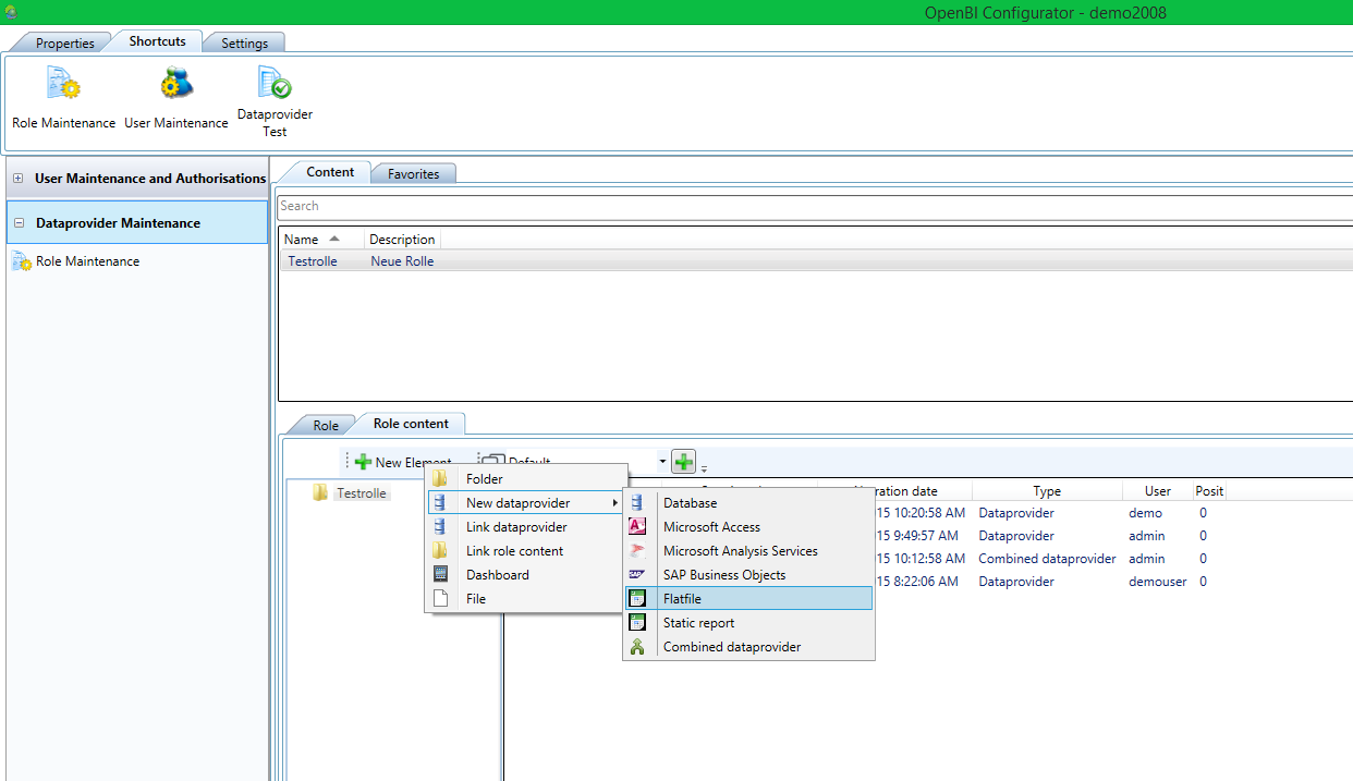
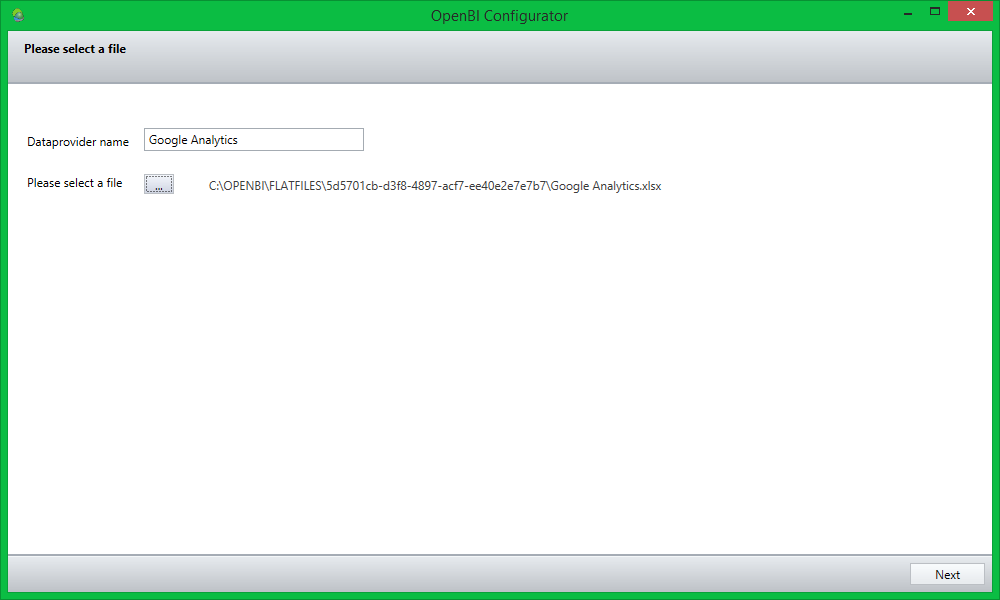
Adding a new Element will start the wizard, seen in the following pictures. First we are going to upload the data…
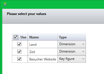
…and define dimensions and key figures. The names of dimensions and key figures euqal the headings of each column. In most cases the system recognizes dimensions and selects the correct type for you. You can always change these configurations.
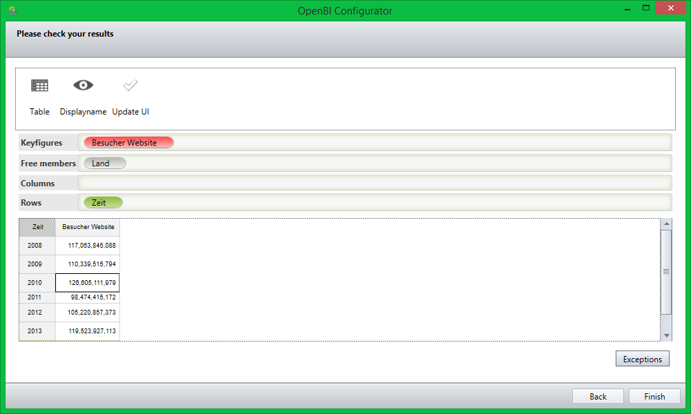
On the last wizard page you can check your settings and change the view on the data according to your needs. You also get a preview of the result in the table below.
You have now successfully added a new data provider to your role.
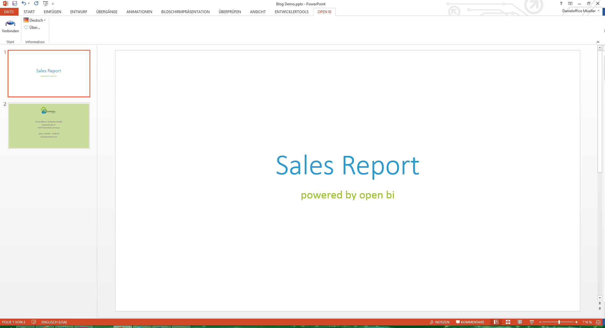
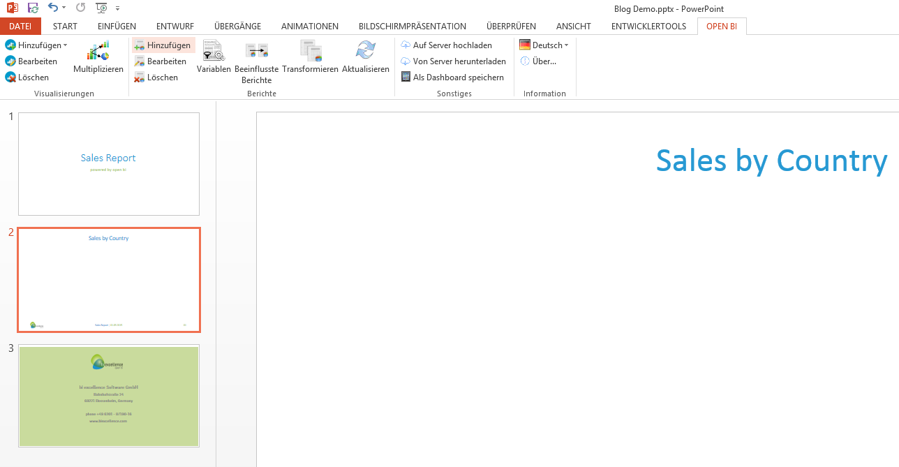
Now let’s switch to Powerpoint and access the data provider we just added to our role.
After installing Office Analytics you will notice a new ‘OPEN BI’ tab in your ribbon bar. Click on connect to connect to the open bi Server.
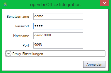
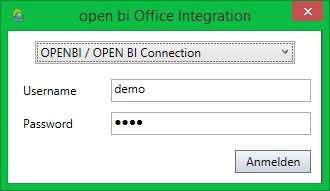
We are going to login to the open bi Server in the same way we previously logged in using the configurator.
After a successful login we now have access to all the powerful open bi functionalities that come with Office Analytics.
We now see all the open bi functionalities in our Ribbon bar. First we add the data provider we just created to the Powerpoint file.
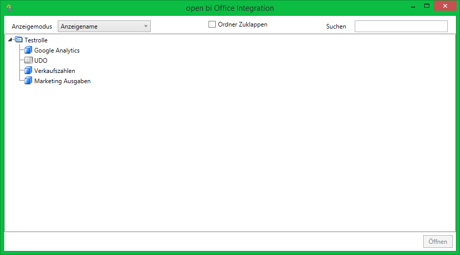
We have access to all the roles and data providers that we are authorized to see.
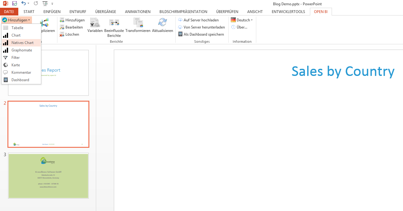
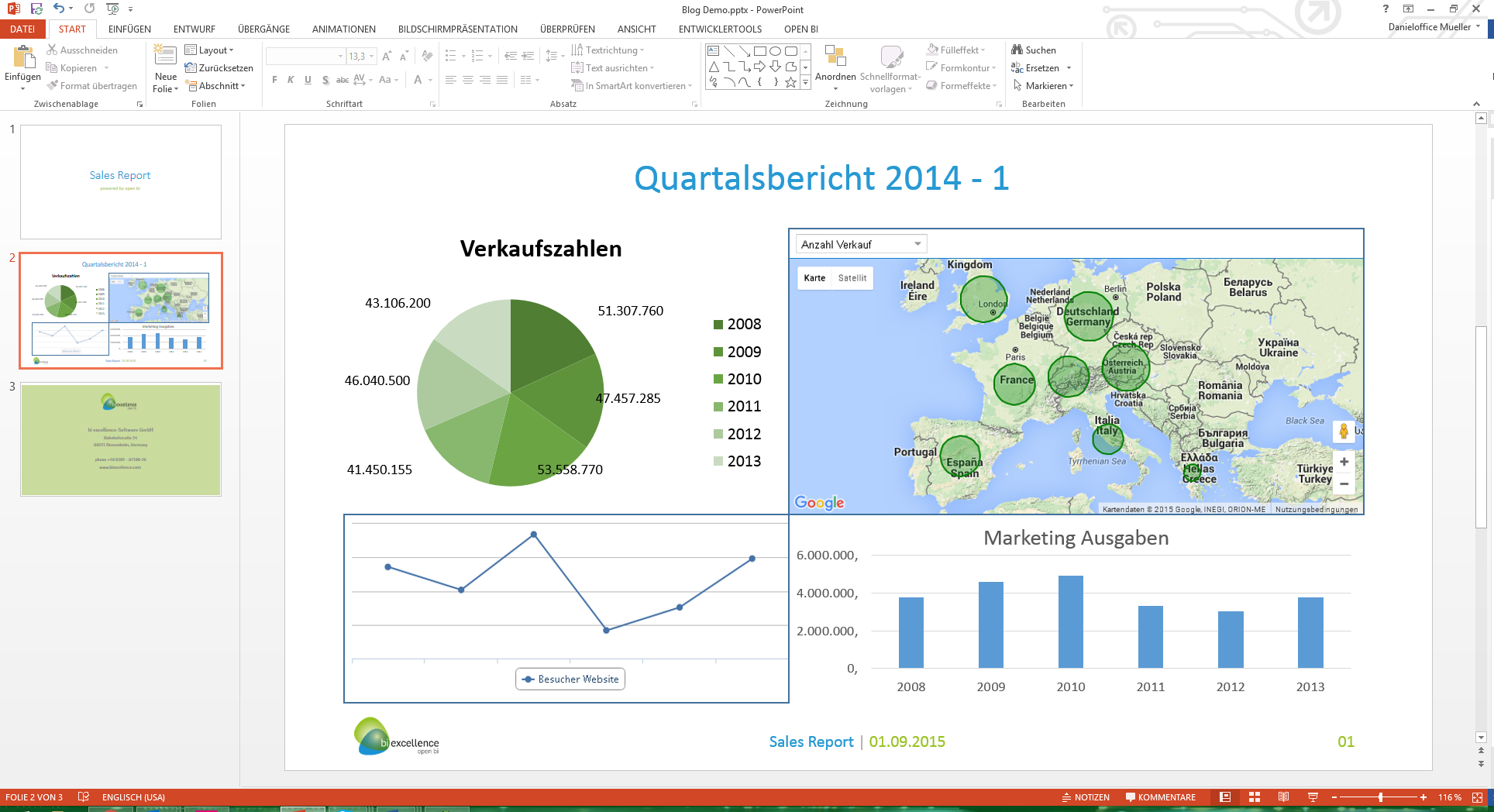
Now that we’ve added the data provider, let’s create a chart based on the data provider’s data.

You can create all kinds of visualizations, including ‘native charts’, which are native Microsoft Office visualizations. That means you can style these charts like you are used to in Microsoft Office. You can also draw styles from your Powerpoint, Word or Excel templates to style the visualizations using your corporate design colors, fonts and styles.
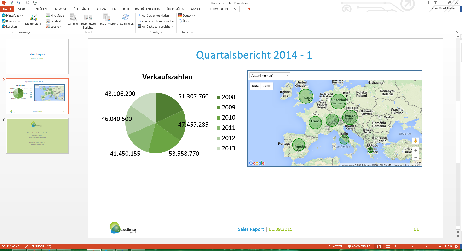
Let’s add another interesting visualization: a Google Map. If your data contains country values, you can display these values on a Google Map. In this case the values are displayed as circles, the bigger the circle in the country, the greater the data value. You can interact with the map during a presentation, for example zooming into certain regions or get the data values by hovering over the countries.
Add more different charts and create your own dashboards, without having to get to know a new software interface.
Next time we are going to upload the dashboard we created in Powerpoint on a web frontend.
Uploading data
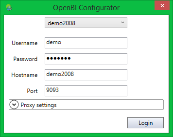
First we need to use the open bi Configurator that comes with Office Analytics. This tool is used to organize your users, roles, data provider and authorization.
Office Analytics comes with a set of demo data. In this demo role (‘Testrolle’) you will find a few data provider.
First let’s add a new data provider. We are going to use an Excel sheet we created earlier.
Adding a new Element will start the wizard, seen in the following pictures. First we are going to upload the data…
…and define dimensions and key figures. The names of dimensions and key figures euqal the headings of each column. In most cases the system recognizes dimensions and selects the correct type for you. You can always change these configurations.
On the last wizard page you can check your settings and change the view on the data according to your needs. You also get a preview of the result in the table below.
You have now successfully added a new data provider to your role.
Creating your first dashboard
Now let’s switch to Powerpoint and access the data provider we just added to our role.
After installing Office Analytics you will notice a new ‘OPEN BI’ tab in your ribbon bar. Click on connect to connect to the open bi Server.
We are going to login to the open bi Server in the same way we previously logged in using the configurator.
After a successful login we now have access to all the powerful open bi functionalities that come with Office Analytics.
We now see all the open bi functionalities in our Ribbon bar. First we add the data provider we just created to the Powerpoint file.
We have access to all the roles and data providers that we are authorized to see.
Now that we’ve added the data provider, let’s create a chart based on the data provider’s data.
You can create all kinds of visualizations, including ‘native charts’, which are native Microsoft Office visualizations. That means you can style these charts like you are used to in Microsoft Office. You can also draw styles from your Powerpoint, Word or Excel templates to style the visualizations using your corporate design colors, fonts and styles.
Let’s add another interesting visualization: a Google Map. If your data contains country values, you can display these values on a Google Map. In this case the values are displayed as circles, the bigger the circle in the country, the greater the data value. You can interact with the map during a presentation, for example zooming into certain regions or get the data values by hovering over the countries.
Add more different charts and create your own dashboards, without having to get to know a new software interface.
Next time we are going to upload the dashboard we created in Powerpoint on a web frontend.