
BIANALYTICS OFFICE VISUALISATIONS
Informative reports and presentations need one thing in particular: Data visualisations! This is why we offer different options for you to be able to create reports, presentations and calculations with data from any data sources.
NATIVE OFFICE DIAGRAMS
Native Office charts are the most popular visualisation in biAnalytics Office. Here the Microsoft Office chart engine is used to create native diagrams, like those you are used to in Office. These diagrams can be formatted as normal Microsoft Office diagrams:
Change chart type, customise colour and typography, attach and hide series, etc.
ANIMATED DIAGRAMS
The HTML5 chart engine by Highcharts is used for animated diagrams. These are particularly popular for presentations, since charts provide more accurate information about value points as soon as the user moves the mouse over the data. Furthermore, the view of the data can be altered with a right click on the diagram. You can therefore spontaneously answer questions from the audience during a presentation: If you are showing sales data from different countries and a spectator is interested in the specific figures for Germany, select drill down with a right click and then Germany and the chart will update with the current sales data from Germany.
Graphomate Diagrams
The graphomate GmbH has been a strong partner of bi excellence for a long time. They provide a chart engine with which the successful HICHERT Diagrams can be created..
Using biAnalytics, you can use these diagrams for your business reports in Microsoft Office.
TEXT MODULES
A text module makes it possible for your to place figures from data sources in running text. For example, if you have the sentence “Turnover in Germany amounted to € 2,500,000” in your Word report you can define “Germany” and “€ 2,500,000” as variable text modules. Select the corresponding cell in the sales report in your data source that shows turnover in Germany.
If you update the document at a later time using the “Refresh” button in the biAnalytics tool bar, the turnover will update in your text. The spectator cannot see a difference between the normal running text and the text which you have variably generated.
Tables
You can use the tables function to present your data in a table. All table styles can be stored here. The best thing about this: If you want to present large amounts of data in tables over several pages or slides, the tables’ header lines automatically repeats over the several pages/slides.
When using table visualisations in Excel, your data is automatically inserted into the active Excel worksheet. The current styles and formats are adopted. The inserted values can now continued to be used as usual in Excel files – for calculation, visualisation, etc.
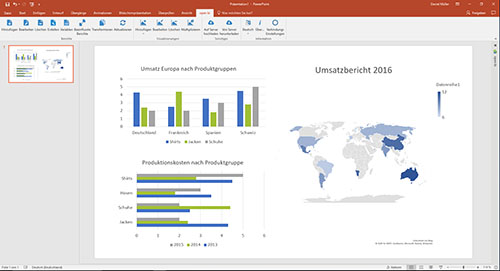
Google Maps
Illustrate location-based data, such as website visits, not just by using diagrams and tables, but also by using our interactive Google Maps chart visualisation. Your data is automatically displayed in the corresponding region on a world map, regardless of whether your data is cities or countries. The values are presented by differently sized circles in the corresponding regions as standard, but other presentation options are possible.
Filter
Add a filter box to your PowerPoint slide and turn your slide into a live dashboard. Filter boxes can be used during a presentation to filter the displayed data live on the current slide. Not only can you filter inserted data, but all underlying data in the report.
Evaluate Now
You can test the full range of biAnalytics Web functions for 30 days, free of charge. Register now and get 1 gigabyte of free memory in our high-performance in-memory database. Do you have complex reporting requirements? We will be happy to provide you with support to optimally implement your requirements. We are looking forward to exciting projects!
Evaluate Now